Changing Photos To Colored Comics

Open the photo in Photoshop, try to choose a good suitable colored photo. Select the Background Layer in the Layers window and press (Ctrl+J) to duplicate the Background layer.

Rename the new layer to B & W, make sure the B & W layer is selected and press (Ctrl+Shift+U) or click Image > Adjustments > Desaturate, now you should have two layers, one of them is colored and the other is B & W.

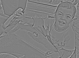
With the B & W layer selected, click Filters > Others > High Pass and change the Radius value if necessary (3.4 pixels here).


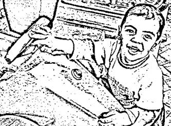
Click Image > Adjustments > Threshold and move the threshold level slider until you get the amount of details that you like (123 here).


Choose the B & W layer and change the Opacity value (the value at the top of the layers window) to 66%.

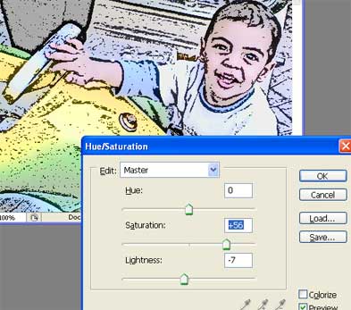
Choose the Background layer and Click "Create new fill or adjustment layer" (located at the bottom of the layers window) and choose "Hue and Saturation..." and add more saturation to give your work more comics art look (56 here) also adjust Lightness if necessary.


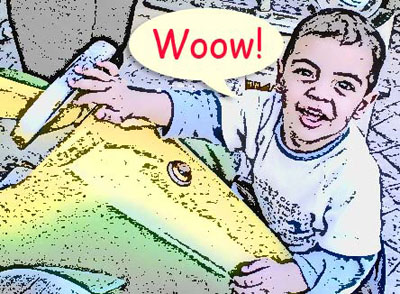
Click Shape tool (U) many times until you get Custom Shape Tool and choose "Talk 1" shape, adjust the shape and change its color as you like.

Click Horizontal Type Tool (T) and add any funny words you like.

Photoshop Shortcuts Cheatsheet for CS2

Photoshop Shortcuts Cheatsheet for CS2


Move faster in Photoshop using keyboard shortcuts. Download this handy PDF cheatsheet, print it out and keep it near your computer (you can choose between a Mac or Windows version):

(Right Click Below Link and Save target as)

Photoshop CS2 Keyboard Shortcuts (Windows)

Photoshop CS2 Keyboard Shortcuts (Macintosh)

These PDF's include 4 pages. The first two pages are organized by function in Photoshop, the last two pages have all the shortcuts organized alphabetically by keystroke (an interesting idea).


How To Change Photoshop Keyboard Shortcuts (CS & CS2 Only)

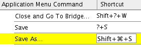
To create your own shortcuts in Photoshop CS or CS2, go to the Edit Menu and select Keyboard Shortcuts. The Keyboard Shortcuts dialog box serves as a shortcut editor, and includes all the commands that support shortcuts.

To modify the keyboard shortcuts you'll have to create a new keyboard shortcut set by clicking on the New Keyboard Set button (the icon to be clicked is immediately to the left of the trash can icon). You'll then be asked to name and save your shortcut set. Now select a heading from the dropdown menu on the left that says Shortcuts For. This allows you to view all of the Photoshop commands in either the Application Menus, the Palette Menus, or the Tools.

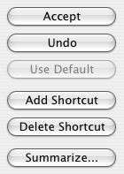
Once you've selected a heading you can search through the contents to locate the command you’d like to change or create a shortcut for. Commands that already have shortcuts will be indicated in the menu. You can change these if you’d prefer by clicking on the shortcut, typing in a new shortcut, and pressing Accept at the top right side of the dialog box.

To make a totally new shortcut, click on the blank space beside the menu command and type in the shortcut you’d like to use. To save it click on the Add Shortcut button.


The hardest part here is finding a key combination that's not already taken. Even the Keyboard Shortcut command has a shortcut (it's Shift-Option-Command-K for Mac and Shift-Alt-Ctrl-K for Win).

Make a picture more clearly

First, Select the picture that you want to make more clearly.
This is my picture, It's not good :


1. Before do anything, for safe, we create other layer by Press CTR + j to Duplicate Layer .


2. Use Filter -> Sharpen -> Unsharp Mask. In this step, we make a picture more clear.
With parameters:
Amount : 75 %
Radius: 1.5 pixels
Threshold: 0 levels

3. Next, we use Filter -> Blur -> Surface Blur. As follow:
Radius: 10 pixels
Threshold: 10 levels

We have result of 3 steps above:


Then, we will use 4 tools of Image -> Adjustment: Brightness/Contrast , Color Balance , Levels and Curves.

5. Brightness/Contrast: with parameters
Brightness: -5
Contrast: +5

6. Color Balance:
Check Preserve Luminosity (if it is unchecked)
Select Shadows and set parameters into Color Levels: -25 -5 -7
Select Midtones and set parameters into Color Levels: -15 +11 -31
Select Highlights and set parameters into Color Levels: -5 +5 +5

7. Levels (or CTR + L)
Channels : RGB
Input Levels: 6 0.88 235
Out Levels: 0 255

8. Continue with Levels:
Channels : RGB
Input Levels: 0 1.00 255
Out Levels: 0 245

9. Curves: You set as figure :
First, with Channel: RGB


Channel: Red


Channel : Green


Channel : Blue


10. Final, we have a new picture

5 Ways to Avoid the Worst Digital

It is not uncommon for beginners to make digital photography mistakes when they first venture into this hobby. I used to make those awful photography mistakes and my photos were terrible!

Below are five common photography mistakes. You can learn how to prevent them when you shoot and fix them. If you can avoid these mistakes, I can assure you that the quality of your photos will increase dramatically!


Red-Eye

Red-eye happens because the light from the digital camera's flash reflects off the retina of your subject's eyes. This is a problem that is so common that even the pros face it too! The fool-proof way is to turn off the flash when shooting. However, if it is really too dark and you must use the flash, remember to ask your subject to face towards your camera but do not look directly at the lens.

Subject is too far

Sometimes, if you subject is too far away, your photo will lack a focal point. You are trying to fit too much into your photo and it will not look great. This mistake is pretty easy to fix. Just get closer to your subject. If you really can't get close enough, use your digital camera's optical zoom. You will realized that your photo and subject will be nicer if they are closer.

Blurry Photos

If you shake your camera or if your subject is moving, you will get blurred photos. The best way is to use a tripod if your subject is still. But, if your subject is moving, you can use the "action" mode in your digital camera. Different cameras have different terms for this mode. Read your instruction manual. This "action" mode function will optimize the shutter speed to capture the action automatically.

Underexposed Photos

Underexposed photos are also one of the very common photography mistakes. It means that there is not enough light and your photo is dark. If you are taking pictures indoor, you can get near a window or move closer to your subject. Besides that, you can also manually adjust the shutter speed of your digital camera.

Overexposed Photos

This means that your photos are too bright. Extreme sunlight or flash can cause overexposed photos. Your photos can have very light or very dark areas. Overexposed photos usually lack detail and can look very washed out. Find a shade when you are shooting your subject on a sunny day. If you are using a flash, do not stand too close to your subject as well.

The above digital photography mistakes are pretty common. The best way to overcome them is to learn from them. Shoot more photos and see how they turn out. If they turn out bad, recall how you took them and under what type of conditions. Try to avoid those mistakes in the future!

Fashion Magazine Style Photo Effect

Start by opening an image of a model.


Duplicate the layer and press Ctrl+Shift+U to desaturate.


Change the color mode to screen.


Duplicate the layer.


Press Ctrl+U to open hue/saturation window. Apply settings as shown.


Freezing Ice Text Effect

Hello all today we are going to make a Icy text effect in adobe photoshop:


First make a canvas ( I used 400 x 200 px ) and fill it with black:


Second we need to type in our text ( I used “Icy” with Ariel Black at 72pt ):


Now rasterize the text layer by right clicking the layer and click Rasterize Type:


Right click the Icy layer and click Merge down:


Goto Filter > Pixelate > Crystallize:


Enter 3 as the Cell Size:


Now goto Filter > Blur > Gaussian Blur:


Enter 1 pixel and click ok:


Now goto Image > Rotate Canvas > 90 CW:


Goto Filter > Stylize > Wind:


Make sure From the Right is ticked and click ok:


Now goto Image > Rotate Canvas > 90 CCW:


Then Image > Adjustments > Hue/Saturation:


Enter Hue: 215 Saturation: 50 Lightness: 0 and make sure Colorize is checked:


And here is your final result:


Thanks for looking at this tutorial and hope you learned from this.

Which File Type is Best for Your Graphics?

Every time a graphic file is saved on the computer, the program saves the artwork with a specific file format. Some formats are high resolution, some are low; some are specific to the native application (like .doc files are MS Word), while others can be used by different computers and different applications.

Just as different software programs are good at performing different tasks, different file formats are good for different purposes. You wouldn't use MS Word to construct a large table of financial data; you'd use MS Excel. The same principle goes for file formats, some are suited for lower-resolution web graphics and email, and others are high-resolution graphics for printing.

Who cares? You should…

This can be down right confusing for a non-expert. In fact, it can be disastrous to spend hours working on a file and have it in the wrong format. Artwork in the wrong file format might be:

  • Rejected by a printer
  • Incompatible with a computer
  • Result in slower download times
  • Reproduce over the Internet or on print with unpredictable or awful results.

All of these will result in costing your more time and money. The good news is: experienced business designers will know from experience exactly which file type to use for each specific circumstance.

For those looking for a little extra knowledge, or gluttons for punishment, here is a quick synopsis of when to use which file type:

.jpg - "jay peg", great for web sites and email, this file format compresses continuous-tone images (like a picture with millions of colors) down to a size that can be downloaded of the Internet quickly. The downside to this format is that compressing the image too much will cause it to visibly degrade and look jagged.

.gif - "gifs", pronounced with a "G", not a "J", also a terrific file type for the Internet and emailing. Gifs do an incredible job of compressing images and making them suitable for fast downloads. In contrast to the .jpg, the .gif is not suited for non-continuous color images, but solid colored images (some cartoons or clip art is a good example of this). One added bonus is that the .gif images can be placed on a web page with an clear background, so you layer them on a web page. Sometimes the artwork has a sharp, unattractive border when the image's background invisible, when this happens, go with the next file type, the .png.

.png - "pings" or "p.n.g's:, this format can act as a hybrid between the .jpg and the .gif, it allows users to compress either non/continuous-tone color images, and allow you to put the on a web page with a clear background. .Pngs are usually larger in file size than the previous file formats but they allow people to save artwork to be layered on web pages or other artwork without any sharp or disruptive border. .Pngs are extremely versatile, but they usually result in larger files and longer download times.

.eps - "encapsulated postScript", these files can be vector or raster - which makes them extremely powerful, this goes beyond the scope of this article. Professional printers and printable advertising media, like a magazine, will typically ask that the artwork be saved as an .eps file or perhaps a .tif. Recently the .pdf document has made some headway into certain areas of printed media as well.

.tif - "tagged image file format", a versatile color space file format (CMYK, RGB, Grayscale) and cross-platform between Mac and PC. The .tif file format was originally intended for scanning, and a lot of scanned images are saved as tifs. Printers and advertisers will often request or permit final artwork to be designed in a tif.

.pdf - "portable document format", Adobe's native file format that is read by a program called Adobe Acrobat. Most computer users have Acrobat on their system, if they don't they can download Acrobat Reader for free. The .pdf has a wide range of uses, including a lot of usage on web, interactive forms and they can even be used for printing.

Top 5 Indications You've Used the Wrong File Format

The printer you are using starts to laugh at you
The printer you are using starts to cry in front of you
Colleagues complain that you are filling up her/his mailbox with large image files
Prospects visiting your web site indicate your company logo looked out of focus and more like a blob of mustard and relish
You've decided on which file format to use based on a novel magic 8 ball