In this tutorial, we will create this effect using very basic Photoshop tools and layering effects. This tutorial is simple enough for a beginner to understand, but I should warn you that in this tutorial there ends up being over 60 active text layers, which will require a heavy use of your computer's memory. Let's jump into this tutorial and layer some glowing text.
Final Image PreviewBefore we get started, let's take a look at the image we'll be creating.
 Step 1
Make a new document that is 2000px by 1200px. Then make a new Gradient Adjustment Layer with a linear gradient that goes from a dark gray (#464646) at the bottom to black (#000000) at the top. This will be our background base.
 Step 2
Make another linear Gradient Adjustment Layer above the previous one, and make it a rainbow of colors of your choice. There are some colorful presets that you can choose from in the gradient palette, or create your own. Set the layer's Fill down to 25%. Then set the layer's blending mode to Color.
Tip: When you set the blending mode to color it makes it so the layer only affects the color of everything below it, while leaving the lightness/darkness alone. Step 3
Finally make another Gradient Adjustment Layer above the previous two. This one will be a radial gradient. Set this one up so that the only 2 colors in the gradient are black and then make the transparency go from 100% at one end and 0% at the other end.
If you see that black is covering the center of the image, check the Reverse box. Then make it so the black goes around the edges of the canvas. Set the layer opacity to 65%. I moved the transparency handles around a little to get the exact effect that I wanted.
 Step 4
Now lets begin with the text treatment. Hit (T) for the type tool, and make a (single click) on the canvas. Then type your letter, in my case a P. Then grab the Move tool and (Hit CMD+T) and transform the letter, adjust it until it's the size that you want it. Hit (T) again for the type tool, and if it's not already, make the letter black by clicking the text color box in the property bar. Set the letter layer's blending mode to Screen. The letter will disappear.
 Step 5
(Double click) to the right of the letter layer's name in the layer palette to bring up the layer styles palette. Put an Outer Glow and a Stroke on the layer with the exact settings that you see below. You will see a very faint image of the letter now.
Let's use this first letter as a starting point for all the text in the image. Once we layer several different letters on top of each other, our effect will come to life.
 Step 6
Duplicate the letter layer by dragging it down to the New Layer button at the bottom of the layer palette. Select the type tool (T) and then change the font on the new layer. If the new font doesn't line up how you want to hit (CMD+T) to free transform the new letter. Make sure that you always line up the baseline of the letters. You can move the anchor point to the base line when you are transforming to keep it lined up correctly.
Now do this step 20 times, each time using a different font. I chose to use all different fonts that have serifs. You can use all fonts that are sans-serif if you like, but I wouldn't mix the two.
 Step 7
Select all the text layers that you have. Then hit (CMD+G) to group them. With the group selected in the layer palette, hit (V) for the move tool. Then (while holding ALT), click and drag on the letters on the canvas to duplicate them. Drag them to the right where you want the next letter to be. Now there should be 2 groups of text in the layer palette. Turn off all the letter layers in the new group (except the bottom one) by clicking in the little 'eye' icon next to each one.
Now select the text tool (T), and highlight the single letter. Then change it to the next letter that you want, in my case an S. Finally, turn the S layer off. Then turn on the next one and do the same. Repeat this until all the letters in your new group are changed. Turn all the layers back on.
Repeat this step for each new letter you need.
 Step 8
Select the elliptical marquee tool and make a very thin ellipse at the base of your letters. Then Feather the selection about 20px. Enter quickmask mode (Q). Then go to Filter>Blur>Motion Blur. Make the angle 0 and the length 700px and hit OK. This gives us a nice fade out to the left and right sides. Then exit quickmask mode (Q).
Now make a curves adjustment layer above the gradients, but below the letter groups. Then apply a curve that looks like the one below. This just gives our letters something to sit on.
 Step 9
Make a new document that is 300px by 300px. Double click on the background layer to make it an active layer. (Double click) to the right of the layer name to open the layer styles palette. Apply a color overlay to make the layer black. Then add an inner stroke that is white to make a border. You can see my settings below.
Go to Layer>Flatten Image to flatten the image. Hit CMD+A to select all and then go Edit>Define Pattern.
 Step 10
Go back to your other document. Make a new blank layer just above your curves layer by hitting the New Layer button at the bottom of the layer palette. Not go to Edit>Fill and select Pattern for the Contents. Then select your black box that should be at the end of the list, and hit OK.
Now Hit (CMD+T) to transform the layer so that it fits in the foreground space. Then (right/control+click) anywhere in the transform box and select perspective. Drag the bottom right handle way out so you get a nice perspective on the pattern layer. Set the layer's blending mode to screen and the opacity to 15%.
 Step 11
There is one last step to add a finishing touch. Select the type layers and duplicate them by dragging them down to the New Layer button. With the new groups selected hit (CMD+T) then (right/control+click) in the transform box and select Flip Vertical. Move them down so they look like a reflection.
With all the reflection groups selected hit (CMD+G) to put them into another group. Set that group's opacity to 25%. Add a mask to the group by clicking on the Add Layer Mask button at the bottom of the layer palette. With the mask selected hit (G) for the gradient tool and apply a linear gradient from black to white, so the reflection fades out as it goes down to the edge of the image.
 Conclusion
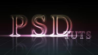


 button and choose Levels.


 button and choose Levels.


